

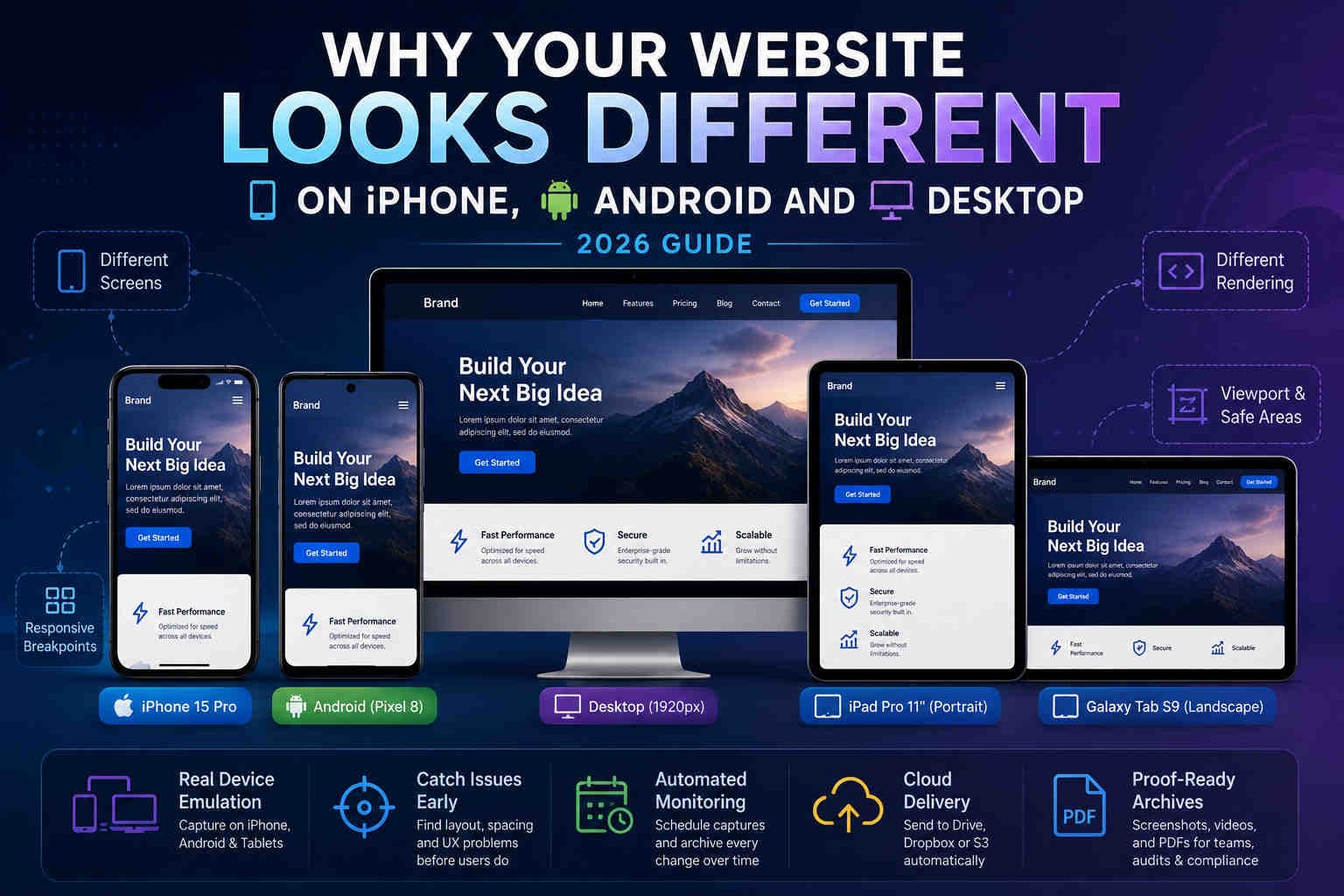
Why Your Website Looks Different on iPhone, Android
and Desktop in 2026
Desktop screenshots are no longer enough. Mobile browsers, responsive breakpoints, safe areas, tablet layouts, and device-specific rendering can all change what users actually see.
A website can look perfect on desktop and still be broken on mobile. The navigation may collapse differently, the call-to-action may move below the fold, cookie banners may cover key content, and iPhone users may see a different layout than Android users.
This is why automated mobile website screenshots matter. Instead of checking only one desktop viewport, you can monitor how your pages render on real device profiles such as iPhone, Pixel, Galaxy, iPad, and Android tablets.
The desktop page looks fine during review.
The same page breaks at mobile breakpoints.
Scheduled captures reveal issues before users report them.
Why websites look different across devices
Responsive design is powerful, but every breakpoint creates a different user experience.
Modern websites are built to adapt. CSS media queries, viewport widths, device pixel ratios, user agents, browser engines, and safe-area rules all influence the final layout. That means a single URL can produce multiple visual experiences.
- Viewport width: changes how grids, menus, and sections collapse.
- Device pixel ratio: affects image sharpness and visual scale.
- User agent: can cause sites to serve mobile-specific content.
- Browser behavior: Safari and Chrome can handle spacing, fonts, and viewport units differently.
iPhone vs Android rendering differences
Both are mobile, but they do not always render the same experience.
iPhone
- Safari-style rendering behavior
- Safe areas around notches and Dynamic Island
- iOS-specific viewport handling
- Different font and form-control rendering
Android
- Chrome/Android-style rendering behavior
- Many different screen sizes and densities
- Device-specific layout differences
- Common differences across Galaxy, Pixel, and older devices
This is why monitoring only one mobile device is usually not enough. A page can pass on iPhone and fail on Android, or pass on a modern flagship while failing on older or smaller screens.
Why tablets are often missed
Tablet layouts are not just bigger phones.
Tablets often sit between desktop and mobile. Some websites show a mobile navigation, some show desktop-like navigation, and some switch to a unique tablet layout. Landscape mode makes this even more complex.
iPad
Often renders closer to desktop layouts while still behaving like a mobile Safari environment.
Android tablets
Frequently trigger hybrid breakpoints with wide layouts and touch-first UI.
Common mobile-only website issues
These issues often never appear in desktop screenshots.
1) Broken mobile navigation
Hamburger menus, dropdowns, sticky headers, and overlays can fail only on mobile layouts. A desktop screenshot will never reveal this.
2) Cookie banners covering the CTA
On mobile, a consent banner can cover the buy button, signup form, or pricing section. This directly affects conversion and compliance review.
3) Mobile-only content changes
Some sites show different pricing cards, simplified copy, alternate banners, or region-specific prompts on mobile devices.
4) Important content pushed below the fold
A hero section that looks balanced on desktop may push important CTAs far down on smaller screens, especially when banners or sticky UI are present.
Which devices should you monitor?
Start with the devices that represent your highest-risk traffic.
| Use case | Recommended devices | Why |
|---|---|---|
| General mobile QA | iPhone 15, Pixel 7, Galaxy S24 | Good coverage of modern iOS and Android users |
| Ecommerce | iPhone 15 Pro, Galaxy S24 | Checkout and pricing must work on flagship phones |
| B2B / dashboards | iPad Pro 11, Galaxy Tab S9 | Tablet layouts often affect dashboard usability |
| Responsive regression | Phone + tablet + landscape variants | Catches breakpoint-specific layout changes |
Screenshots, videos and PDFs for mobile monitoring
Each format tells a different part of the mobile story.
Best for visual proof, layout checks, and long-term mobile archives.
Best for menus, scrolling behavior, modals, and animated mobile interactions.
Best for audit packs, stakeholder review, and compliance documentation.
How automated mobile monitoring works
You don’t need to manually open every device every morning.
- 1) Create a Web Profile for the mobile device.
- 2) Select the device preset, such as iPhone, Pixel, Galaxy, iPad, or Galaxy Tab.
- 3) Choose portrait or landscape where needed.
- 4) Attach the profile to a Shot Schedule.
- 5) Deliver captures to Google Drive, Dropbox, or S3-compatible storage.
FAQ
Quick answers.
iPhone uses iOS Safari-style rendering behavior, safe-area rules, and viewport handling that may differ from Android Chrome or desktop browsers.
Yes, especially for pricing, checkout, signup, legal, or campaign pages. iPhone and Android users can see different layouts.
For B2B apps, dashboards, documentation, and tablet-heavy audiences, yes. Tablet breakpoints can be completely different from phone and desktop layouts.
Daily is a good baseline for important pages. Use higher frequency during campaigns, launches, or pricing changes.
Start monitoring mobile views
Capture iPhone, Android, tablet, portrait, and landscape views on a schedule — then deliver the results to your own cloud storage.
TL;DR
The simple version.
- Desktop screenshots do not prove what mobile users saw.
- iPhone, Android, iPad, and Android tablets can render different layouts.
- Mobile-only issues often affect navigation, banners, checkout, and CTAs.
- Monitor at least one iPhone, one Android phone, and one tablet for important pages.
- Use screenshots for proof, videos for interactions, and PDFs for reporting.